Why Event Marketing Works Better When the Event Website Supports the Experience
Why Event Marketing Works Better When the Event Website Supports the Experience
An event website works best when it supports the full attendee journey, not just the first click. It gives people the information they need before they register, helps them feel confident about attending, and keeps the event experience clear from the first visit.
That is why the website should work closely with the wider campaign. Whether the event is planned by an experienced London events agency like Markely Agency or supported by web specialists such asVamos Web Design, the aim is the same: turn interest into action with a clear, useful, and easy-to-use online experience.
If the website is confusing, slow, vague, or light on practical detail, people may hesitate. They might still like the idea of the event, but they may not feel ready to register.
Why an Event Website Matters Before the Event Begins
Before someone attends an event, they make a series of small decisions. Is this relevant to me? Can I make the date? Is the location easy enough? Does the event feel well organised? Is the price fair? Will I get value from going?
Your website helps answer those questions.
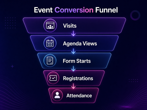
Good event marketing gets people interested. The website then has to turn that interest into understanding. This is where many campaigns lose momentum, especially when visitors have to search for basic details.
It turns interest into a clear next step
A strong event page helps visitors understand the offer quickly. They should be able to see who the event is for, what they will get from attending, where it is happening, when it takes place, and what they need to do next.
This sounds simple, but it is often where friction starts. If the date is hidden, the registration button is buried, or the agenda is vague, visitors have to work harder than they should.
Once the basics are clear, design and content can do much more useful work.
It sets expectations before people arrive
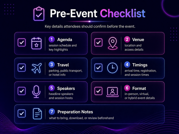
The website also shapes the experience before the event starts. It can explain the agenda, venue, travel details, timings, speakers, format, and any preparation needed.
When those details are easy to find, the event feels more organised before the person has even stepped through the door.
Event Marketing Needs More Than Visibility
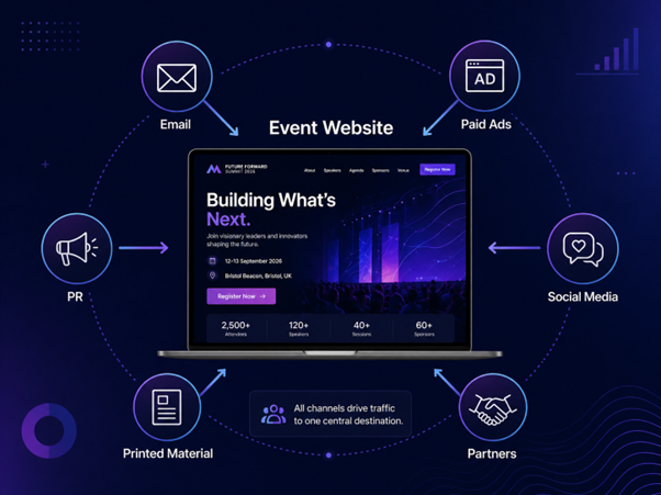
Visibility matters, but it is not the whole job. Paid ads, email campaigns, organic search, social posts, partner promotions, and PR can bring people to the website. The website then has to support the decision. This is where a joined-up approach matters, as Markely Agency explains in its guide to building a unified marketing strategy across all platforms.
There is a clear demand for in-person experiences in the UK. The Guardian reported that Togather saw a 30% annual rise in bookings across the UK during summer 2024, with company events, weddings, parties, and smaller gatherings all part of that wider increase.
For event organisers and marketing managers, that is a useful reminder. People are open to attending events, but they still need a smooth route from interest to action.
The website has to match the promise of the campaign
If your campaign looks polished, helpful, and well planned, the website should feel the same. It does not need to be overdesigned, but visitors should recognise the same message, tone, and visual direction that brought them there.
Every campaign needs one reliable destination
Without a central page, event information can become scattered across social posts, PDFs, email threads, third-party listings, and internal documents.
That creates problems. Someone might see an old time on a social post, miss an agenda update, or email the organiser with a question that should have been answered online.
A reliable event page gives every campaign one clear destination for the most accurate information.
What Good Event Website Design Should Support
Good event website design is not only about how the page looks. It is about how easily people can understand the event and take action.
The design should guide attention, helping visitors move from the headline to the key details, then from the details to registration.
Consistent branding
The website should feel connected to the event brand and wider campaign. Colours, fonts, imagery, tone of voice, and visual style should match the experience being promoted. Markely Agency’s guide to why great graphic design is the backbone of your brand identity explains how design choices shape the way people recognise and remember a brand.
This helps the journey feel joined up. If someone clicks from an advert, email, or social post, they should land on a website that feels familiar and reinforces the same message.
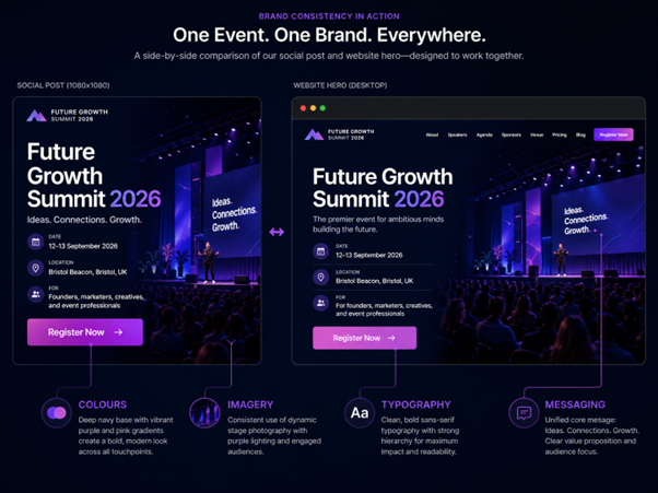
Clear messaging
The messaging should answer the visitor’s first questions quickly. What is the event? Who is it for? Why should someone attend? What will they leave with? When and where is it happening?
This is especially important for conferences, exhibitions, product launches, workshops, networking events, and corporate experiences. Each type of event has a different reason to attend, so the wording should make that value clear.
Specific wording gives people something clearer to respond to.
Simple navigation
Visitors should not have to hunt for the basics. If the page is long, clear section links can help people move to the agenda, speakers, pricing, location, FAQs, or registration.
Simple navigation is useful because different visitors arrive with different needs. A good structure lets each person find their answer quickly.
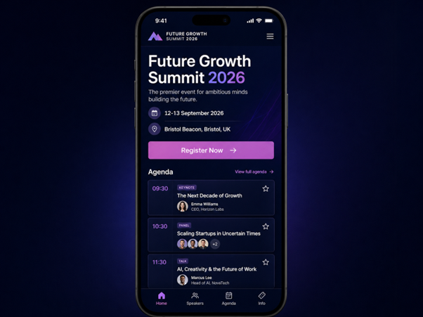
Mobile-first layout
Many people will first see your campaign on a phone. That might be through LinkedIn, Instagram, email, a WhatsApp share, or a paid ad.
Exploding Topics reported in July 2025 that mobile devices account for 64.35% of all website traffic. For an event campaign, that means the mobile experience is often where first impressions, agenda checks, and registrations happen.
A mobile-first layout should use readable text, clear buttons, short sections, fast-loading images, and forms that are easy to complete on a smaller screen.
Accessible event information
Accessibility is part of the user experience. It is not separate from good design.
Visitors may need to know about step-free access, nearby parking, public transport, dietary options, seating, arrival points, toilets, quiet spaces, timings, or who to contact with specific questions.
Providing this information early can remove uncertainty. It also shows that the organiser has thought about the practical details that affect real people.
How the Website Supports the Attendee Journey
The attendee journey does not start at the venue. It starts when someone first hears about the event and decides whether it is worth their time. The website can support each stage if the content is planned properly.
Before registration
Before someone registers, they may be looking for proof that the event is relevant, credible, and worth attending. Useful content at this stage can include speaker details, previous event photos, partner logos, testimonials, venue information, pricing, FAQs, and a clear explanation of who the event is for.
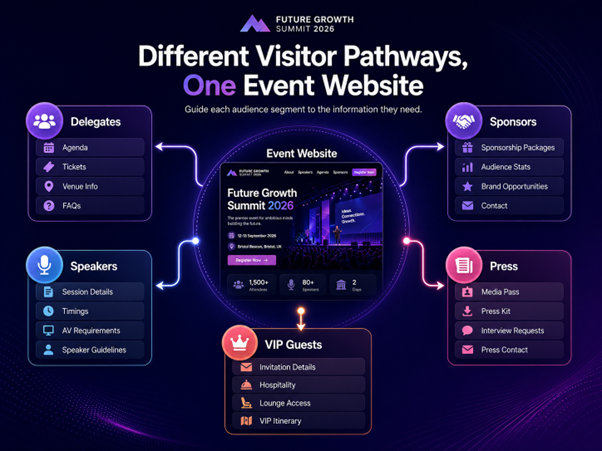
For different audience types
Not every visitor needs the same information. A delegate may want the agenda. A sponsor may want audience details. A speaker may need logistics. Press contacts may need media information. VIP guests may need arrival instructions.
This does not mean building a complicated website. It can be as simple as using clear content sections that help different people find the right information.
For larger events, this can make the page feel more useful because it recognises that the audience is not one single group.
During registration
An event registration website should make the form feel easy, logical, and safe to complete.
Long forms can create friction, especially on mobile. Ask for what you genuinely need at that stage. If extra information is needed later, consider collecting it after the first registration is complete.
The page should also explain what happens next. Will the attendee receive an email? Can they add the event to their calendar? Is there a ticket? Can they edit their details later?
Small details like these reduce uncertainty.
After registration
After someone registers, the website can still support the experience. It can hold updated agendas, venue details, travel notes, contact information, FAQs, and useful resources.
This keeps attendees informed and gives organisers a central place to update details if timings, speakers, or arrival instructions change.
Why an Event Landing Page Can Improve Campaign Results
An event landing page is useful when you want one focused destination for a specific campaign. This could be a paid ad campaign, email campaign, social campaign, or a single event within a wider website.
The value of a landing page is focus. Instead of sending visitors to a general website, you send them to a page built around one action, such as registering, joining a waiting list, downloading details, or enquiring about sponsorship.
Fewer distractions
A focused page removes unnecessary choices. It keeps the visitor close to the reason they clicked in the first place.
This is helpful when the campaign has a clear message. If the advert promotes a leadership breakfast, the page should speak directly to that event, not send people through a broad list of services or unrelated content.
The less work the visitor has to do, the more likely they are to continue.
Better tracking and reporting
Marketing managers need to know which channels are doing the best job. A focused page makes that easier to measure.
You can review which campaigns bring visitors to the page, which sources lead to registrations, and where people drop off.
This turns the website into a useful reporting tool, not just a place to publish event details.
Common Website Problems That Weaken Event Marketing
Even strong event campaigns can underperform if the website creates friction. Many issues are easy to spot once you look at the journey from the visitor’s point of view.
Too much information in the wrong order
Some event pages include all the right information, but place it in the wrong order. For example, they may lead with a long background story before giving the date, location, audience, and reason to attend.
Visitors usually need the basics first. Once they understand the event, they are more likely to read deeper supporting content.
Unclear actions inside the page
The page should make the next step obvious. That might be registering, viewing the agenda, downloading details, contacting the organiser, or enquiring about sponsorship.
If the button text is vague, hidden, or inconsistent, visitors may pause. Use clear wording so people know exactly what will happen when they click.
Missing trust signals
Trust signals help people feel more confident. These might include speaker credentials, partner logos, venue details, previous event photos, testimonials, organiser information, or contact details.
Weak mobile experience
A website can look polished on desktop and still feel awkward on mobile. Testing it on a phone before launching the campaign is one of the simplest ways to catch issues such as cramped buttons, long forms, heavy images, and confusing content order.
How Event Websites Can Support Search Visibility
Event websites can support organic search when they are planned around real questions, not just promotional copy.
Search visibility often comes from being specific. A page that explains the event type, topic, location, audience, and purpose gives search engines and visitors more useful context.
Use clear page titles and headings
The page title and headings should describe the event in plain language. This helps people understand the page quickly, and it helps search engines understand what the page is about.
For example, a title that includes the event type and location is usually more useful than a creative name on its own. You can still use the event name, but it should be supported by clear wording.
Add useful details that answer real questions
People search for practical answers before they attend events. They may want to know the date, venue, price, agenda, speaker line-up, location, format, accessibility details, or whether the event suits their role.
Adding these details makes the page more helpful and reduces the need for visitors to contact the organiser for basic information. FAQs can also work well when they answer genuine questions rather than repeat the same sales message.
How the Website Adds Value After the Event
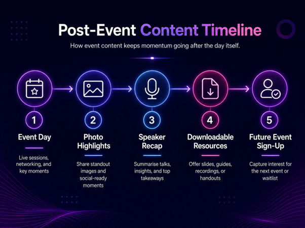
The website does not have to stop working when the event ends. For many organisations, post-event content can extend the value of the campaign.
This is especially useful for annual events, recurring workshops, brand activations, business conferences, and events linked to a wider marketing plan.
Recap content keeps the event visible
After the event, the page can be updated with highlights, photos, videos, speaker summaries, key takeaways, downloads, or links to related resources.
This gives attendees somewhere to return to. It also gives people who did not attend a way to understand what happened and why the event mattered.
Recap content can also support social posts, email follow-ups, and stakeholder reports.
Post-event content can support future campaigns
A useful recap can help promote the next event. It gives future attendees a clearer idea of what to expect and gives sponsors or partners evidence of the event’s value.
This is where the website becomes part of a longer marketing cycle. The event creates content, the content supports visibility, and that visibility can help the next campaign perform better. Eventbrite’s UK and Ireland TRNDS 2025 report says consumers are looking to shared real-life experiences as part of self-improvement and connection, which makes post-event storytelling more useful for organisers who want to keep interest alive.
Measuring Whether the Website Is Supporting the Event
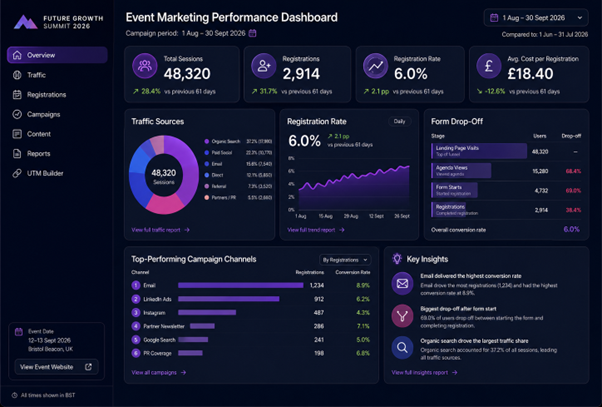
A good event page should be measured by more than visits. Event organisers and marketing managers need to know whether the website is helping people take the right actions.
Track the right actions
Useful actions might include registration button clicks, form starts, form completions, agenda clicks, speaker profile views, contact clicks, sponsor enquiry clicks, and return visits.
These actions show how people are using the website and whether the content is doing its job.
Review drop-off points
If lots of people visit the page but few register, there may be a problem with the offer, the form, the page structure, or the amount of trust information available.
If people start the form but do not complete it, the form may be too long, unclear, or awkward to use on mobile.
Website data cannot explain everything, but it can show you where to look.
Compare campaign source to registration quality
Not all traffic has the same value. One channel may bring fewer visitors but more registrations. Another may bring lots of clicks but very little action.
By comparing traffic source with registration quality, marketing managers can make better decisions about where to spend time and budget for the next campaign. Visual suggestion: Add a simple reporting dashboard screenshot or mock-up here showing traffic sources, registration rate, form drop-off, and top-performing campaign channels.
Bringing the Event and Website Experience Together
Event marketing works better when every part of the journey feels connected. The campaign creates interest, the website builds confidence, the registration process removes friction, and the post-event content keeps the value going.
That does not mean the website has to be complicated. In many cases, the best event websites are clear, focused, and practical. They answer the right questions in the right order and make it easy for people to take the next step.
For event organisers and marketing managers, the website should be treated as part of the event experience itself. A well-planned event website can support visibility, registrations, attendee confidence, campaign reporting, and the longer-term value of the event.
Frequently Asked Questions
Our
Recent Blogs