Our WorkCase StudiesMaritime Brand Identity
Case study · BRAND IDENTITY
Charting a New Visual Identity for a Maritime Industry Partner
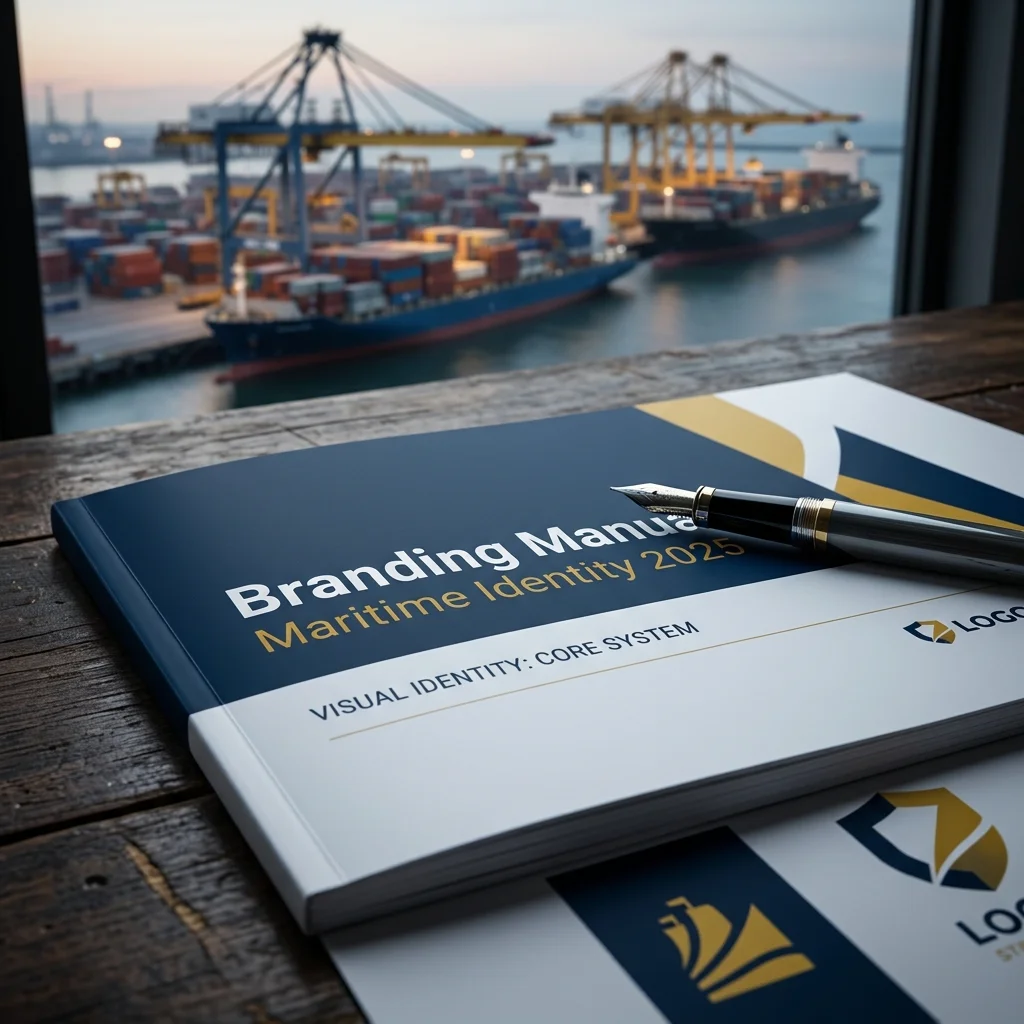
A 47-page Branding Manual that unified shipping companies, port operators and technology firms behind one trusted, modern identity.
47
page branding manual
The project
One identity for a whole maritime corridor
In global logistics, clarity and collaboration are the anchors of success. Our client set out to turn a strategic maritime corridor into a recognised hub for innovation and sustainable growth, and asked Markely to build the brand that would carry it.
Objective
Develop a comprehensive brand identity that unifies shipping companies, port operators and technology firms, and positions a strategic maritime corridor as a hub for innovation and sustainable growth.
Challenge
Create a visual language that feels both authoritative and approachable to government bodies, academic institutions and private-sector leaders. It had to say “trust and reliability”, signal clean maritime operations and digital transformation, and perform from a 90px mobile icon to a full-size roll-up banner.
Approach
A multi-tiered system rooted in maritime heritage: Dark Marine Blue as the anchor colour, a dual-font hierarchy, a custom icon suite and a 47-page manual that holds every touchpoint to the same standard.
The system at a glance
Built to hold up at every scale
pages in the master brand blueprint.
from a mobile icon up to a full conference roll-up banner.
grid for the custom minimalist icon suite.
bleed specified for high-end print production.
The strategy
A foundation of Dark Marine Blue
A multi-tiered strategy rooted in maritime heritage and optimised for the future: authority from the primary colour, energy and optimism from the secondary palette.
Dark Marine BluePrimary
#0F2A47
Warm Golden Yellow
#F0B83C
Soft Green
#8FCF9B
Vivid Red-Orange
#F2522E
Montserrat
HEADINGS
Bold and modern, giving titles presence across reports and brochures.
Open Sans
BODY & SECONDARY
Clean and versatile, built for readable technical content.
▦ ◧ ◉
ICONOGRAPHY
Minimalist icons on a 32px grid that break up dense text and make data-heavy content easier to digest.
What we delivered
The Branding Manual: every touchpoint covered
01
LOGO SYSTEMS
A responsive logo with clear-space rules measured by the wordmark’s X-height, in horizontal and stacked versions.
02
DIGITAL & SOCIAL
Web banners from 320×50 to 300×250, plus LinkedIn and Instagram cover templates.
03
PRINT & STATIONERY
A4 letterhead, business cards and 300gsm matte brochure layouts with 3mm bleeds.
04
LARGE FORMAT
Panaflex and roll-up banners with padding planned for legibility at distance in industry forums.
In summary
What it achieved
- Visual consistency. Strict “Logo Don’ts” stop stretching and unauthorised colour changes, whichever vendor or department uses the mark.
- Legible on any image. Subtle white and dark gradient overlays keep the logo clear over complex port and vessel photography.
- Stakeholder alignment. A unified front that reflects the collaborative nature of the cluster.
- Enhanced professionalism and market readiness. Quality print materials plus a digital-first toolkit for rapid campaign and event rollout.
Need a brand that works from a 90px icon to a conference banner?
Tell us about your project and we’ll get back to you.
Our recent work